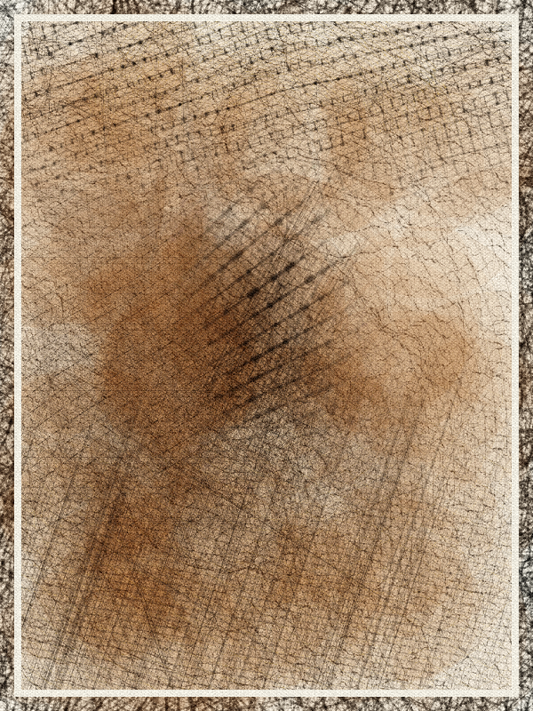
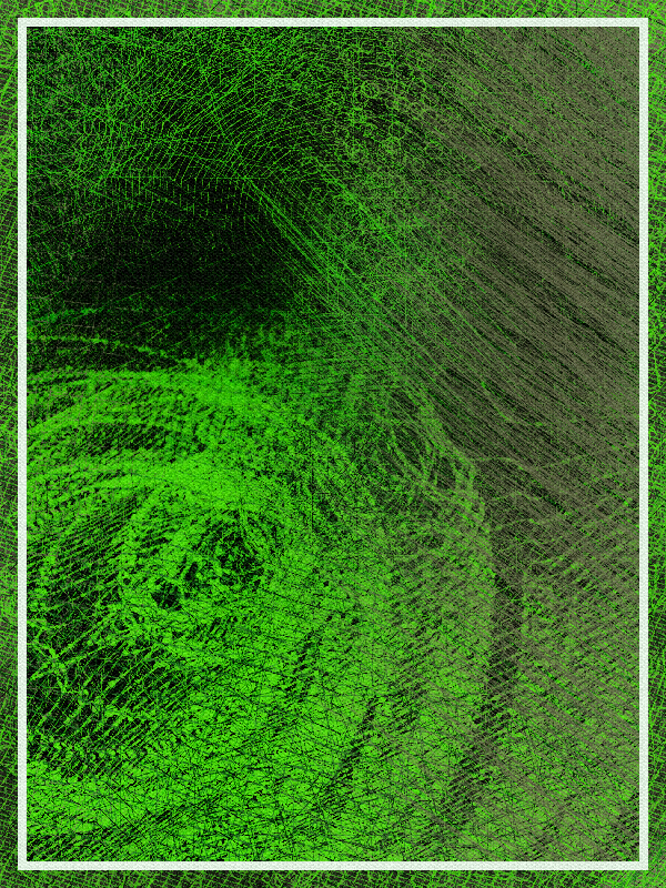
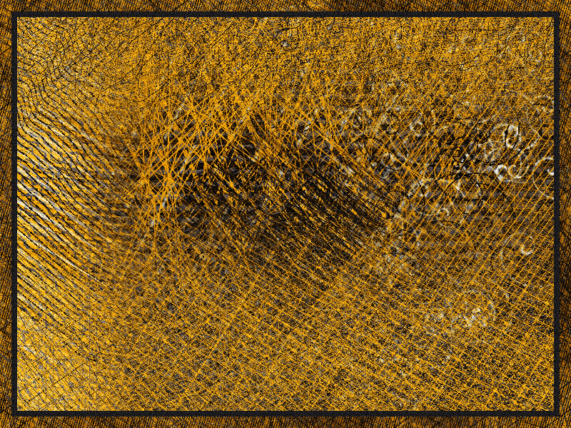
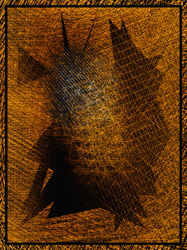
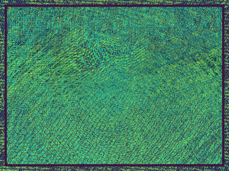
My initial goal was to create artwork that could trigger raw, visceral emotions and feelings. A polar opposite to the polite, clinical precision of some other collections, I wanted to embrace the grittier side of abstract art.
This turned out to be a rather difficult project for me. It was a departure from my usual figurative / ink line style, where most of the time I find it straightforward to tell a "good" output from a "bad" one. Here, out of my comfort zone, I couldn't tell. I liked some outputs, I hated some. The ones I hated, usually would be someone else's favorites. Abstract art is hard !
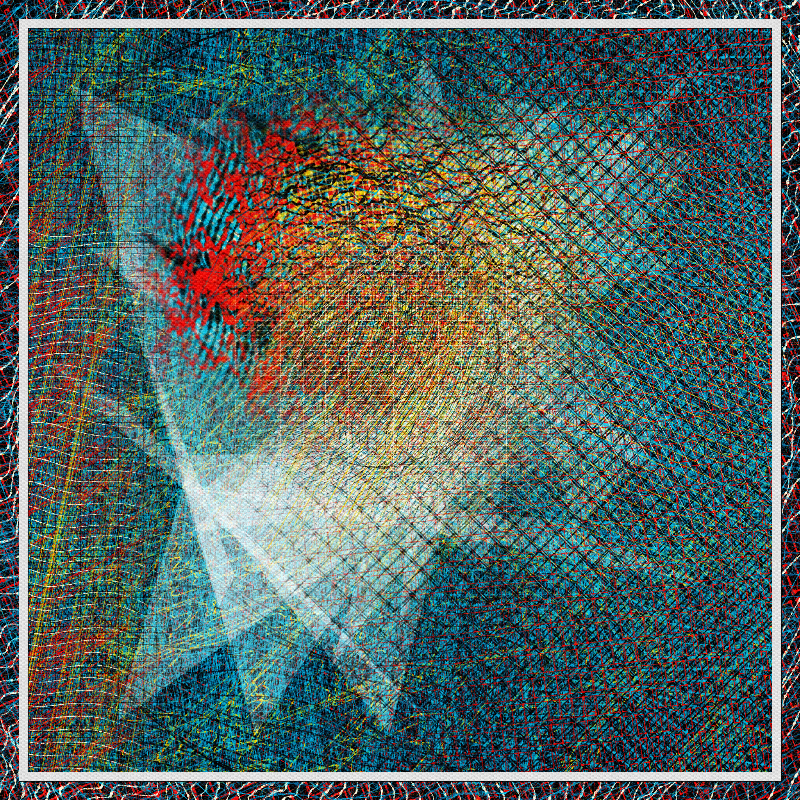
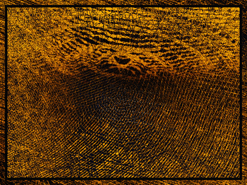
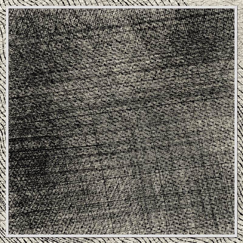
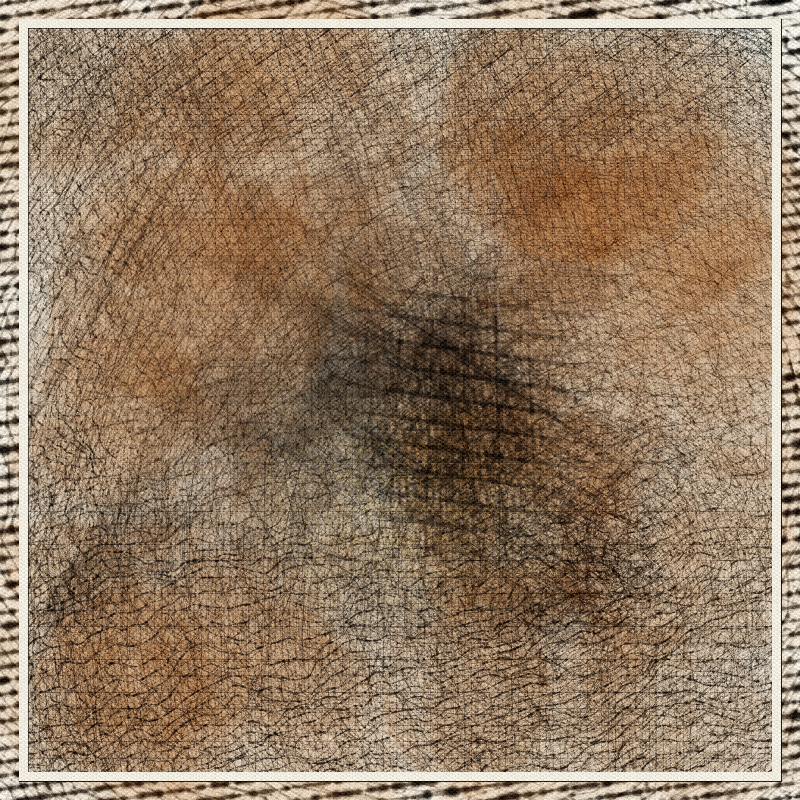
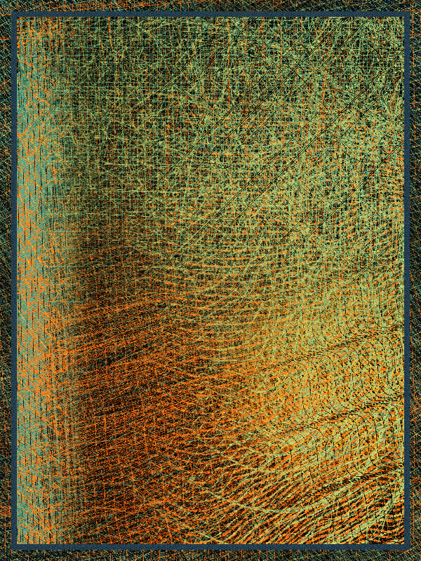
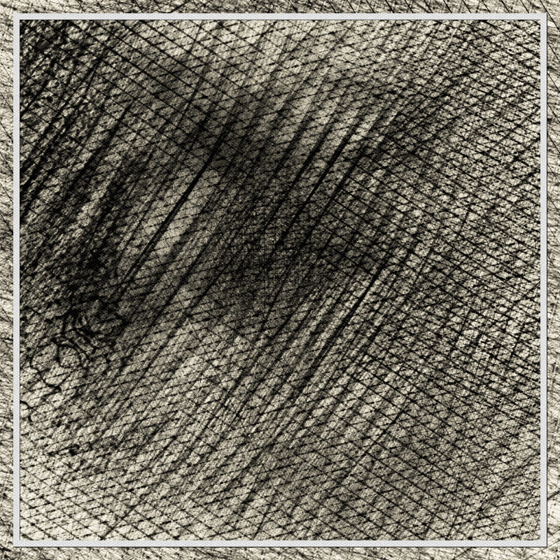
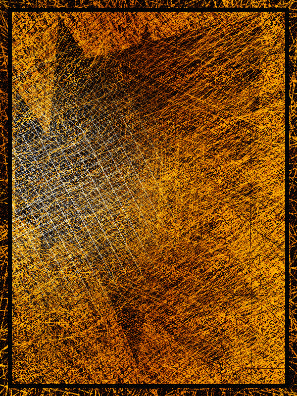
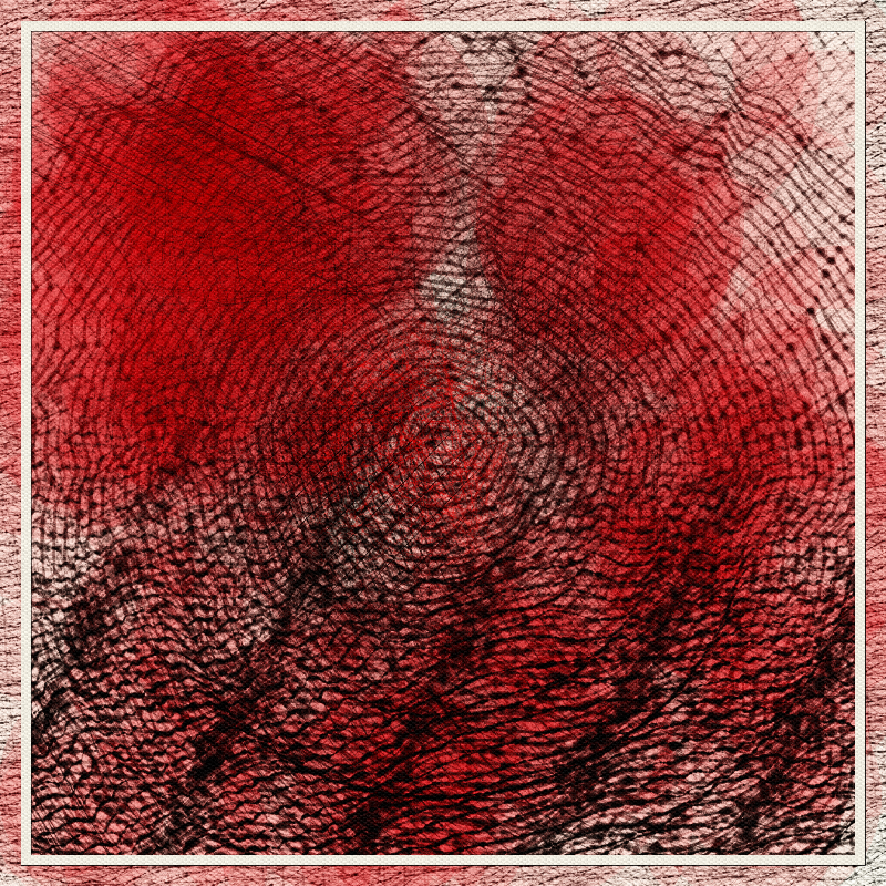
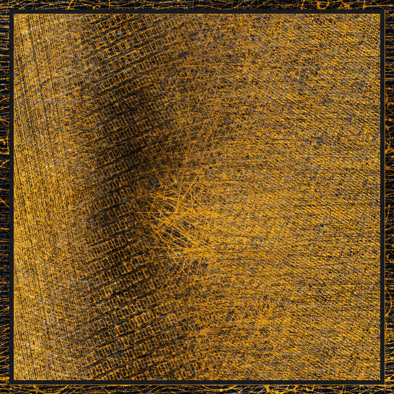
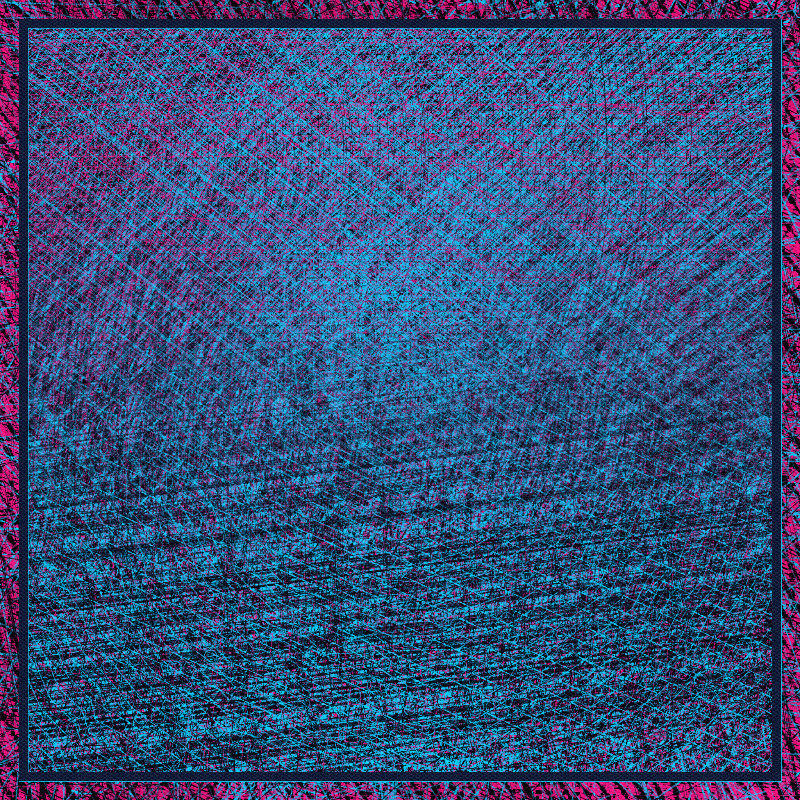
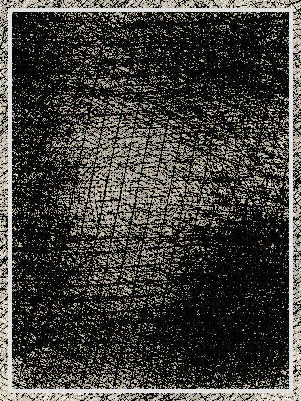
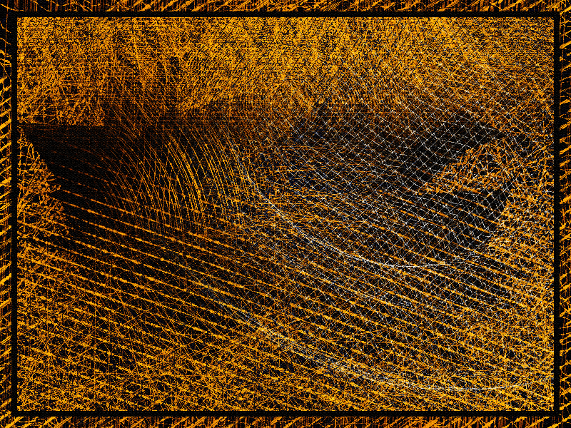
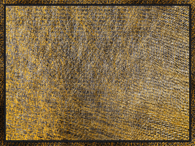
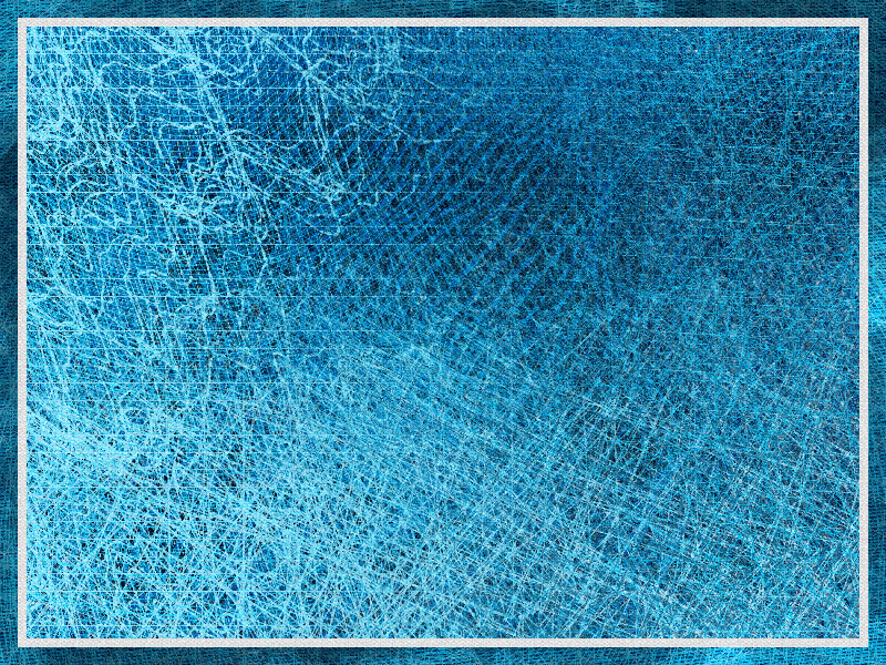
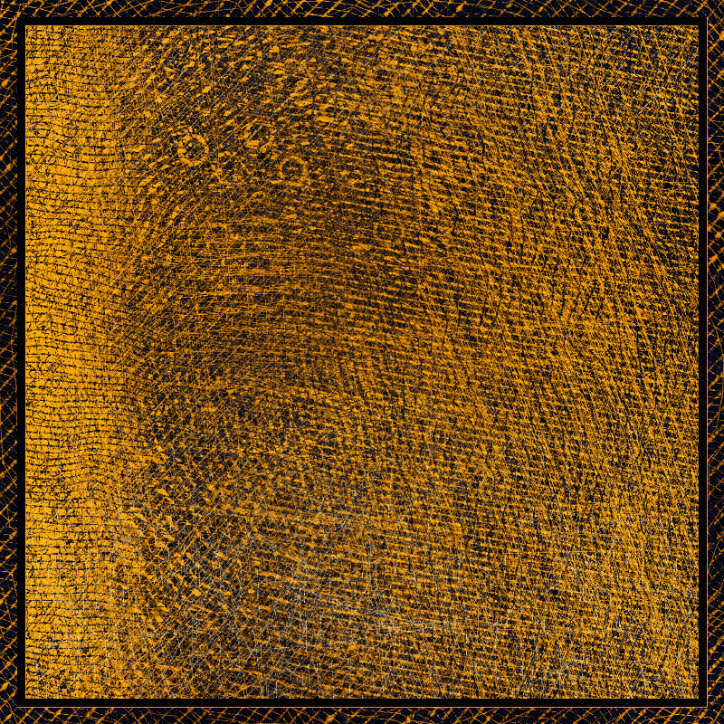
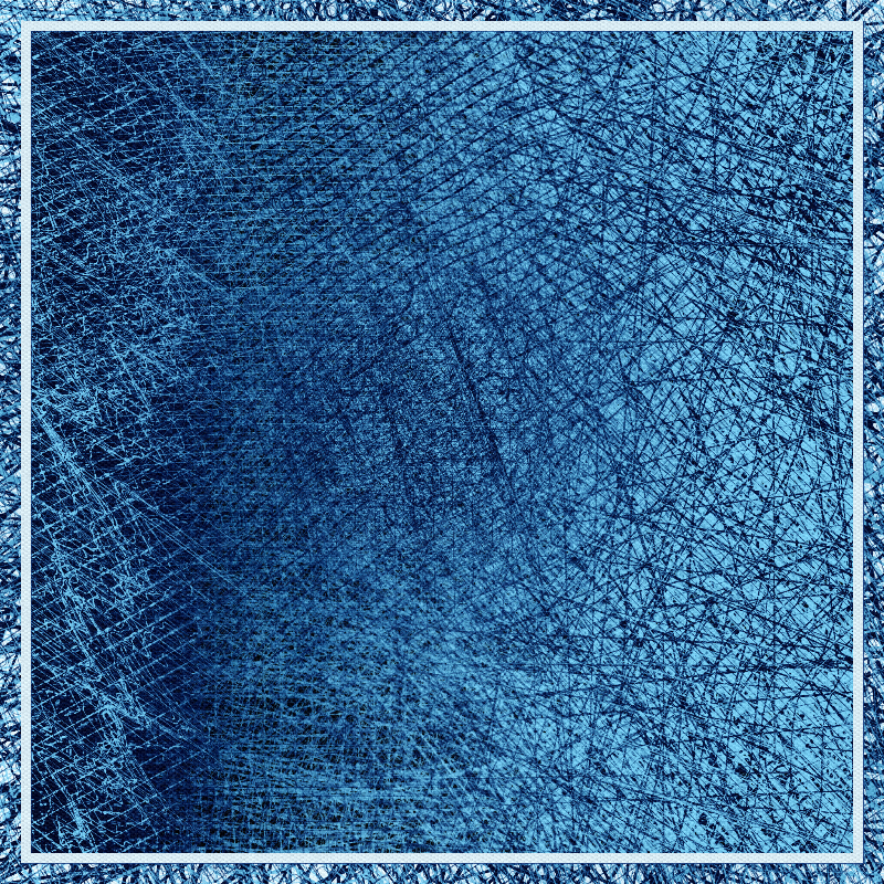
After a while, some patterns started to emerge. The overall feedback was that, generally: - blue outputs were peaceful - orange ones were intense and aggressive - black and white ones were oppressive and sometimes disturbing
If you can associate an emotion to any given output, I feel like I will have achieved my goal. Thank you to everyone who provided feedback !
Technically, this project also posed a number of challenges: - how to blend a large number of procedural textures in a smooth, yet natural way - how to make sure the final piece has some kind of depth, visible beyond the intricate layering - how to optimize contrast and get vibrant results
This was mostly achieved by spending a lot of time designing and fine-tuning color schemes - enhanced versions of color palettes, that also contain pre and post-processing settings.
The collection features a total of 31 color schemes.