On stripes, planes and Anna Lucia's work
written by no1.tez
Anna Lucia's artistic journey is a story of renunciation and re-enchantment. "As a kid and teenager, I was always making something; I worked a lot with collage and fabric and constructed clothes, and besides making things, I loved visiting art museums," she recalls.
Her early exposure to abstract art left a deep imprint on her. “I remember opening a book on Kandinsky when I was around 7; it felt like a world opened up to me. I still remember this moment so vividly, it must have made a big impression on me. I never understood how people didn't 'get' abstract art; it came naturally to me that it was art and beauty. As I got older, I took more interest in the abstract geometric art of the 60s and 70s. And I think the love for art from this time influences my aesthetics strongly.”
After graduating, Anna Lucia studied fashion design. A year later, she switched to engineering. "Since then, I was always looking for a way to express myself artistically, but nothing clicked. It didn't come as naturally as it had done when I was young. That was until I discovered Processing, a Java library designed with artists and designers in mind. That was at the start of 2019, and I haven't stopped making things through code since then."
The artist was strongly drawn to generative art, as it allowed her to “constantly go back and forth on controlling and letting go. If there is no authority at all, and you let go fully, all you will make is noise. While if you control the algorithm too much, there is no more room for emergence and surprise. Where I draw that line differs from algorithm to algorithm.”
In August 2021, Anna Lucia minted her first NFT. A few months later, she gave up her engineering job to make art full time.
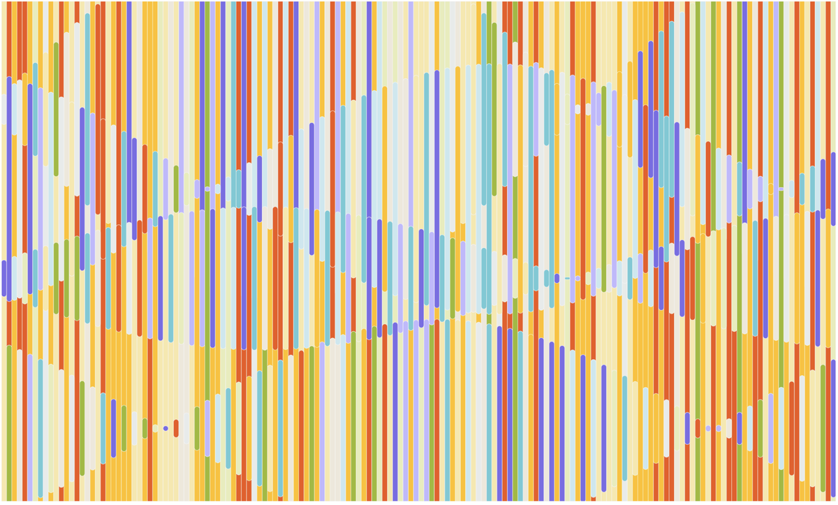
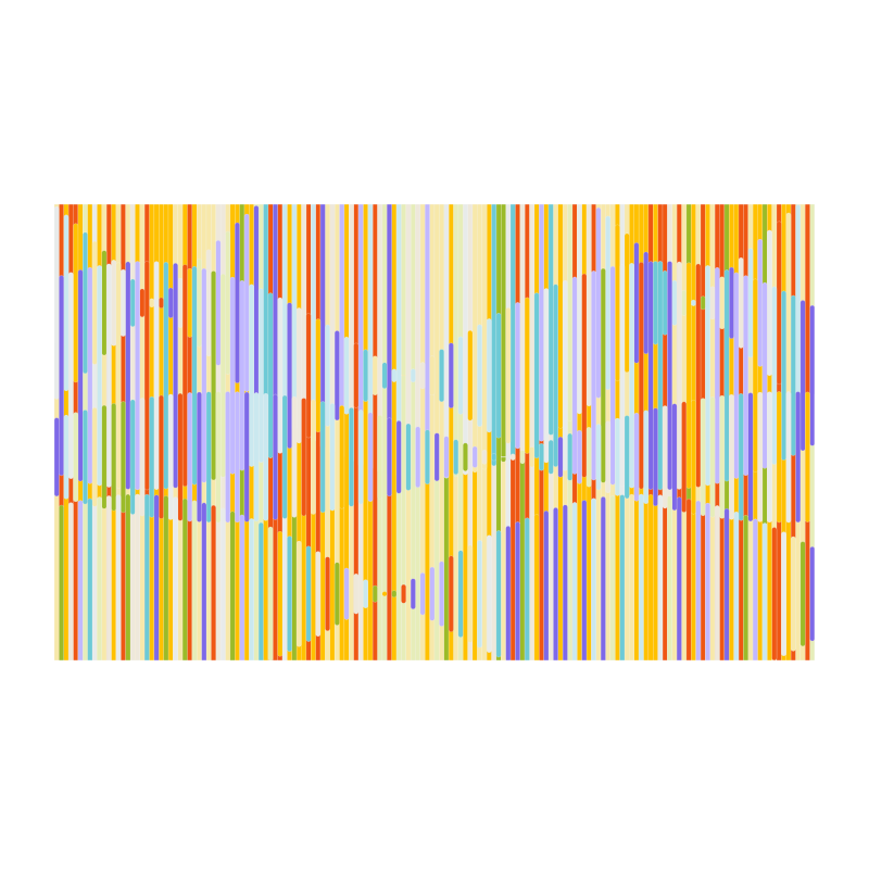
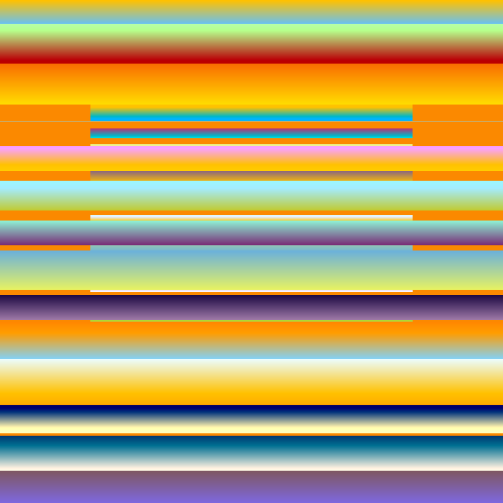
Art For Walls In Public Spaces (2022)
Art For Walls In Public Spaces #5
In Art For Walls In Public Spaces, Anna Lucia's debut work on FXhash, the primary compositional units are stripes. Sometimes undervalued, regarded as a mere ornamental motif for wallpaper or fabric, the stripes' seeming simplicity, their uniform layout, as well as their rather constrained chromatic and formal characteristics conceal the many parameters that regulate the interplay of visual forces and determine their perceptual quality: the stripes' regularity, color and width calibration, frequency, distribution, etc.
If stripes remain one of the oldest patterns in existence, their cultural status, however, has varied in time and space. Once an ornament of regalia items in Pharaonic Egypt, they were viewed as a pejorative symbol in the European medieval value system. Although medieval scholars assumed that the Scriptures provided a rationale for the prohibition of striped clothing (except for specific categories of individuals removed from the social order), the issue was perhaps more visual than religious. In The Devil's Cloth: A History of Stripes, Michel Pastoureau provides a plausible explanation for why they were shunned in the Christian Middle Ages through a detailed exploration of the history of aesthetic tastes and preferences:
“People in the Middle Ages seemed to feel an aversion for all surface structures which, because they did not clearly distinguish the figure from the background, troubled the spectator's view. The medieval eye was particularly attentive to reading by levels.
[...] Now, with stripes, such a reading is no longer possible. There is not a level below and a level above, a background color and a figure color. [...] With the stripe — as with the check, another pattern the medieval sensibility finds suspect — the structure is the figure. Is that where the scandal originates? (1)”
Stripes were later reinstated in Renaissance attire, and have subsequently carried different social values and identities over the centuries.
In art, the stripe asserted itself as an autonomous device in the 20th century, alongside other elemental forms such as the grid. "It was a logical early addition to the lexicon of abstraction, given its ability to circumvent the hierarchy inherent in the figure/ground relationship. This dehierarchizing potency led to the proliferation of stripes throughout high Modernist art, from that of figurative artists like Picasso and Matisse, to the radical innovations of the Russian Suprematists, to those of the Constructivist artists working internationally in Europe and Latin America from the 1920s on. (2)” Bauhaus artists such as Gunta Stölzl, Benita Koch-Otte and Anni Albers investigated their aesthetic potential, most notably as a decorative motif in tapestry (3).
However, it was not until the 1960s that the formal properties of stripes were fully appreciated, when they became not only part of a repertoire of abstract patterns, but a governing agent in many artists' work (4). Serge Poliakoff may be regarded as one of the forerunners, with his work Bandes Colorées (1937). Gene Davis, Bridget Riley, Agnès Martin or Sol LeWitt followed, as well as Frank Stella, who in 1966 made clear his view that his paintings should be seen as purveyors of a pure visual experience of unconditional abstraction: "All I want anyone to get out of my paintings is the fact that you can see the whole idea without any conclusion. What you see is what you see. (5)”
In Art For Walls In Public Spaces, the contingent and unstable nature of color is engendered by a horizontal wave-like motion that moves colors around. The stripes, on the other hand, are arranged vertically. The eye is prompted to adopt both a vertical and horizontal reading of the work.
The color displacements follow waveforms with more or less steep peaks, creating an undulating, flowing pattern that orchestrates the color clusters and provides rhythmical accents. Some pieces feature rows of superimposed waves that radiate their choral and aggregate energy over the digital canvas (#106, #108 for instance). In outputs featuring a reduced number of stripes (30 or less), the chromatic changes unfold in an upward motion (see for example #32, #38). In both cases, the focus is wavered by the progression of uniform color stripes that move rhythmically.
Anna Lucia's color swaps are somewhat reminiscent of the “crossovers” that can be seen in Riley's work from the late 60's and early 70's. After discovering an important optical principle, namely that perceptual effects appear most intense when they run counter to the underlying formal structure (6), Riley began to inject additional visual tension by designing her stripes with colors that cross each other horizontally, in a zig-zag formation (Zing 1 and 2, 1971; Vapour, 1970). The friction between the directionality of the stripes and that of color creates clusters of light that disrupt the stripes, and guides the eye towards the horizontal chromatic corridors.
A similar eye-catching effect was sought by Gene Davis in the 1980s, by playing (although in a less orderly way than Bridget Riley) on the irregularity and discontinuity of colors to introduce purple, yellow, green zones distributed horizontally, forming zig-zag patterns (Carnival, 1981; Monet's Garden, 1980; Fox Gate, 1982). The alternation of colors along the stripes causes them to appear like a cascading rain.
Similarities can also be drawn with Sarah Morris' work involving bars and stripes which tap into the aesthetics of visual representations of sound (Machines do not make us into Machines, 2019*;* Your Words Become Mine, 2018).
In Art For Walls In Public Spaces, the color distribution scheme is algorithmically generated — depending on the palette of each piece. Stripes of identical or adjacent tones can sometimes be found next to each other, creating large monochromatic color reserves. Alternatively, some pieces offer juxtapositions of complementary colors, resulting in strong contrasts.
Anna Lucia often uses Illustrator to compose the color palettes. “I will pick colors from references and previous sketches and build a base. Then I start thinking about how prominent I want each color to be in the piece, and I assign a probability to each color, i.e, some colors have a high chance and form a base. In contrast, other colors have a lower likelihood and are accents.”
“Art For Walls In Public Spaces is quite a curated and constrained algorithm for color use and consists of multiple color palettes. The probabilities are adjusted carefully for each color palette. The stripe's location can influence the color possibilities, and the background stripes are milder and miss the accent colors of the foreground waves,” she explains.
In the most heavily streaked pieces (300 stripes and more), the reduced intervals between colored stripes almost blurs the boundaries separating them and creates a degree of optical overflow. The same boundary-blurring effect can be seen in pieces with a relatively moderate number of stripes that are dominated by light hues, such as pale yellows and greens in #99 (160 stripes). In this iteration, a showpiece of modulations and contrasts, the typical flatness of stripe art is disrupted by the stark difference between soft pastels and bold, bright colors. The difference in chromatic intensity virtually organizes the pictorial space into a foreground and background: the pastels' gentle brightness and the sharp character of the more saturated lines of colors gives the impression that some stripes merge in a common tone, and create tightly modulated harmonies cut by strong contrasts. Stripes in a deeper shade (red, green, blue, orange and purple) seem to jump out against a background layer of orange, yellow and green rows rendered in pastel tones.
Art For Walls In Public Spaces #99
Outputs displaying contrasts of hue are evocative of Bridget Riley's post-1982 stripe paintings, where she abandoned her Egyptian palette consisting of black, white, and two pairs of almost-complementary, isoluminant colors (red, turquoise, yellow, blue) (7). She then allowed herself to deploy a broader palette and to put the deepest hues next to the lightest ones (Bali, 1983; Tabriz, 1984).
Perpetual Oscillations (2022)
Perpetual Oscillations #1
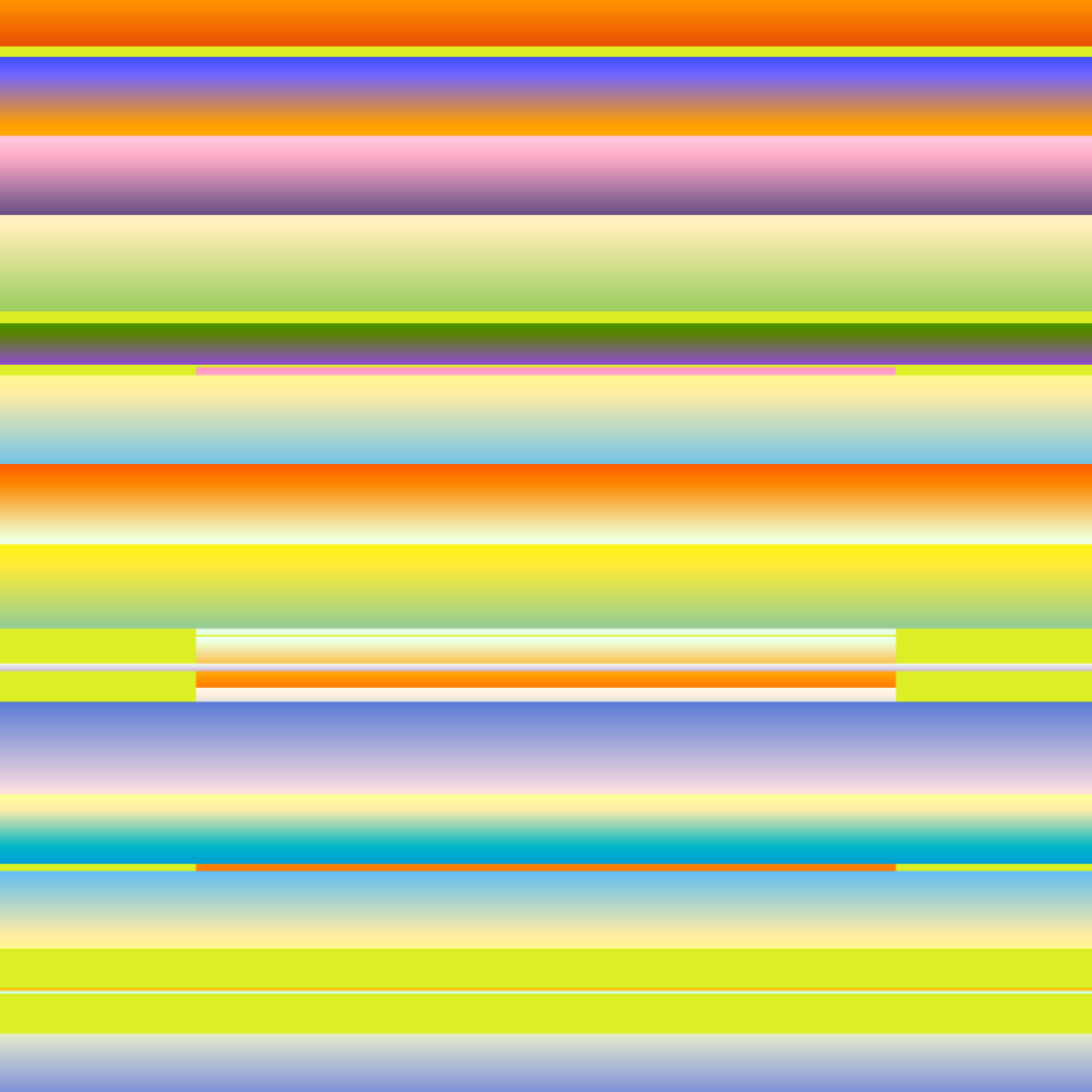
Anna Lucia's exploration of the expressive and structural properties of color is carried further in Perpetual Oscillations which, this time, uses wider stripes than Art For Walls In Public Spaces.
In this series, light and color effects are more refined. The chromatic values interact with one another within each plane, and between the planes themselves. “The color range is more random for Perpetual Oscillations. I've put less control and constraint on the color assignment and only prepared one color palette for all outputs. The little constraint I did add was to limit the possibilities of background colors from the larger color palette, and I developed a few color pairs for the case of duotone outputs,” Anna Lucia describes.
The tone gradations that can be seen in this series, be it the sequencing of colors within each plane, or through the interplay of several planes, produce a rhythm of radiance. The gradients are given a careful treatment, enabling the colors to unfold in different hues via transitions of tone and saturation. While each plane has its own colorimetric profile, it is through the changing relationship they share with each other that their visual identity is defined.
The planes contract and expand following different rhythms, creating apertures below which one can not only catch a glimpse of the background (which plays an active role in this series), but also a series of smaller, narrower planes. The partial covering of the background planes by those of the foreground introduces optical depth and invites the viewer to step further into the frame. The layering of the planes is designed to make it look like there is a second work nested within the larger one. The eye is guided through the succession of colored stripes, into a deeper realm consisting of several other interlocking horizontal or vertical bars.
Movement is an essential component of Anna Lucia's work. Both Art For Walls In Public Spaces and Perpetual Oscillations are animated by a steady and rhythmic motion, which introduces a duration for the visual experience. The energy that flows from her works conveys a sense of balance and harmony. Speaking of how she organizes movement in her art, Anna Lucia says that "for both works, I wanted to achieve a calm and hypnotic effect. A movement that walks a tightrope between being almost unnoticeable and easy to ignore while at the same time drawing you in, with different amplitudes, phases, and starting points."
Certain iterations of Perpetual Oscillations can be matched with contemporary color field expressions. One is reminded, when looking at Perpetual Oscillations, of Jenny Holzer's heavily color-scaled horizontal planes, executed in two to three separate colors each and hiding declassified or redacted documents of which only fragments are revealed to the viewer. In Holzer’s work, the color relationships are built through tonal gradations, or sometimes by the intervention of achromatic tones (gray, white) which are given a remarkably colorful quality. The key aspect here is the need to avoid unvarying tones: the interrelation of colors — the very essence of this form of art — can easily be compromised if the tones are flat. The colored surfaces are not self-enclosed: they are meant to open up to other parts of the canvas through gradients.
The shapes, on the other hand, are non-assertive since their primary function is to serve as a vehicle and a carrier for color. The more neutral the shapes, the greater freedom they enable for color expression.
In Perpetual Oscillations, outputs featuring horizontal planes carry the illusion of landscape. Those in which the background planes are dominated by warm tones (orange ochres, pinks, reds) might evoke for the viewer a lush, tropical sunset, as seen behind shutters that are slowly moved by the breeze, or concealed by clouds that capture the intense, boreal glow of the atmosphere.
Perpetual Oscillations #38
“Aesthetically I think my work develops in natural evolution,” Anna Lucia says. “I think all my works are constantly conversing with each other, and one work flows from another. I often take elements and concepts and develop them further into something new. Art For Walls In Public Spaces came from an earlier piece I made called Art For Subways, while Perpetual Oscillations carries elements of Art For Walls In Public Spaces again. Some of the ideas of those works can be found again in the more recent 3D works I have published on Tezos, like Town Square, and This Too Will Change.”
Although she currently exclusively makes code-based artworks, Anna Lucia says she is interested in experimenting with physical mediums. “Mediums that I'm drawn to at the moment are textile, especially experimenting with embroidery, ceramics, and printing techniques such as rizo. I think working with physical mediums can be very exciting because you are met with very different constraints than when you work with code.”
R.Z.
Last edit: 28/11/22
References:
(1) Michel Pastoureau, The Devil's Cloth: A History of Stripes and Striped Fabric, Washington Square Press, 2003, p. 5.
(2) Alex Bacon, Lineup - Press Release, Almine Rech Gallery, 2019.
(3) See: “Weaving Workshop”, In H. Bayer, I. & W. Gropius, Bauhaus, 1919-1928, The Museum of Modern Art, 1938, pp. 58-61.
(4) John Russell, Art: The ‘Heroic Sublime’ Or The Use Of The Stripe, The New York Times, June 13, 1986.
(5) Bruce Glaser, Questions to Stella and Judd, ARTnews, 1966.
(6) Paul Moorhouse, A Dialogue With Sensation: The Art of Bridget Riley, In: Bridget Riley, Tate, 2003, p. 19.
(7) N.A. Dodgson, Mathematical characterization of Bridget Riley's stripe paintings, Journal of Mathematics and the Arts, Volume 6, 2012, pp. 89-106.